Location-based Social Media
Jeti V2
Project Overview
Jeti is a location-based social media platform, made to bring communities closer together and foster better online discourse. Users are only shown posts, pictures, videos, and messages from people 6-12 miles around them.
After a successful launch, and with 40,000 new users, we found the current UI less performative than desired and lacking in expandability. The decision was made to redesign the entire experience from the group up, with a cleaner UI, friendlier user experience, and new and upcoming features in mind from the start.
Role
Project Lead
UX/UI Design
Research
Tools
Figma + Plugins
Typeform
UXcam
Scope
Four months, August - November 2021
Old Onboarding
V2 Onboarding
Old Explore
V2 Explore
Old Feed
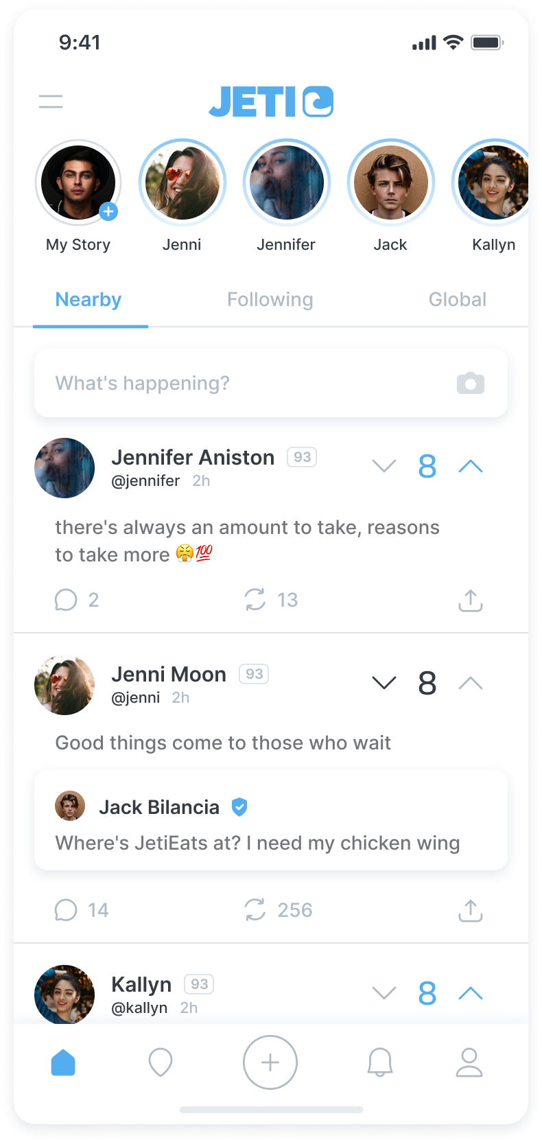
V2 Feed
Old Profile
V2 Profile
Research
Features
As a lack of adaptability for new features was one of the driving reasons behind the redesign, we began by identifying the core features we planned on implementing with the new UI, as well as features that were to be added post-update.
UX Audit
Feedback from our users led us to question some aspects of the current design and led us to conduct a screen-by-screen audit of the current UI. We utilized UXCam to collect and visualize data on user flows, chokepoints, and areas causing errors for users.
User Surveys
Throughout the entire process, we used the official Jeti account to gather user feedback. To start, I created Typeform surveys asking users about their usage habits, desired features, and current frustrations with their experience on Jeti.
Design Process
User Flows
We began the process by reworking key user flows that we had identified as being an issue, with our top priorities being the leaderboard, onboarding, menu, and profile interaction flow. Additionally, we created flows for new features, such as a user waitlist, ID verification, stories, and live streaming.
When we were satisfied with the flows, we created high-fidelity UI prototypes for testing and continued to refine them in collaboration with our engineers, to ensure desired functions could be implemented effectively.
Feedback & Testing
Thanks again to our close relationship with our community, we were able to ask them directly about design choices within the app itself. As an example, the team disagreed on how the upvote/downvote should be styled on posts, so we decided to settle it by asking our users.
During the design process, we also made full use of Figma’s prototyping functions, building out and testing new flows, interactions, and animations.
Onboarding Flow with Waitlist
The five designs for voting


